Back to portfolio

NBA InPlay · Onboarding v2 proposal · January 2019

How might we improve the new user experience?

I explored aligning the shipped v1 screens to more standard UX patterns for a v2 proposal.

Mastering the Moment

Tap Turbo before the play happens

NBA InPlay was FanDuel's second-screen app for live NBA games. You drafted a player for each quarter, then tapped the Turbo button at the right moment to multiply your fan points. In January 2019 I audited how the shipped app taught that and proposed a v2 that lets new players learn Turbo by doing it.

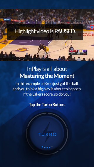
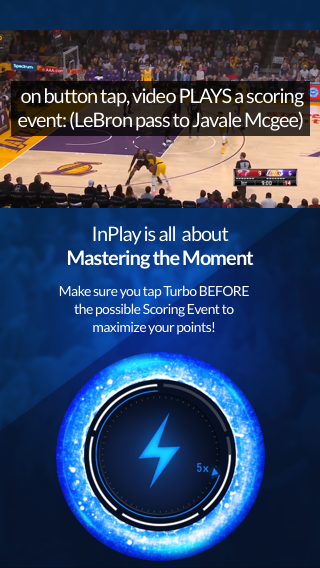
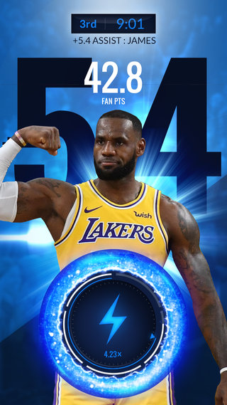
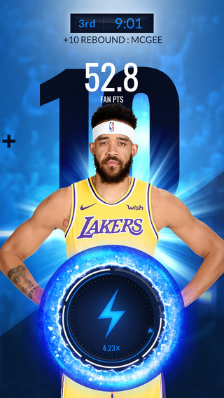
In the proposed tutorial, the clip pauses as LeBron gets the ball. You tap Turbo, the play runs, he passes to JaVale McGee, and the points land. The shipped app told players to press Turbo when their player was hot. This version was designed to let them feel the timing, which is the real skill in the game.

Tap to see it in action.

Paused highlight of LeBron James with the ball, above a Turbo button and the line "InPlay is all about Mastering the Moment." v2 new player, step 6: tap Turbo, practice LeBron James with 42.8 fan points. JaVale McGee with 52.8 fan points.

Tap Turbo (Learn by doing)

The audit

The onboarding experience reached the first meaningful game choice seven screens in.

The shipped onboarding gave everyone the same nine screens. Tapping Play led straight to a microphone request, then a four-card carousel of rules, and only then to the game schedule.

I defined the high-value actions as Choose Game, Draft Lineup and Tap Turbo. In the shipped flow a new player reached the first one at step 7 and finished all three at step 9.

I proposed splitting new and returning players right after the splash screen. A new player would reach Choose Game at step 3 in a guided first game and finish all three tasks by step 6. The new-player path isn't shorter. It adds a practice game before the real one. I moved the teaching out of the carousel and into the tasks, with one plain instruction on the screen where each task happens. A returning player would skip the tutorial and go straight from announcements to the schedule.

Shipped v1, inherited (everyone)

The shipped InPlay onboarding in nine phone screens: splash, a microphone permission request, four tutorial cards, then the game schedule, player draft and Live Play with the Turbo button.

  1. 1Splash, tap Play
  2. 2Mic permission
  3. 3Rules card, Pick a Game
  4. 4Rules card, Pick a Player
  5. 5Rules card, Hit Turbo
  6. 6Rules card, Score, tap Got It
  7. 7Choose a game
  8. 8Draft a player
  9. 9Tap Turbo

v2 new player

The proposed new-player flow in nine screens: splash, a new-player announcement, the game schedule and draft with one instruction each, a paused LeBron highlight with the Turbo button, two points screens and Turbo Tips.

  1. 1Splash, tap Play
  2. 2Announcements for new players
  3. 3Choose a game (practice)
  4. 4Draft with the assistant (practice)
  5. 5Highlight paused
  6. 6Tap Turbo (practice)
  7. 7Payoff, LeBron 42.8
  8. 8Payoff, McGee 52.8
  9. 9Turbo Tips, see today's games

Then the real game

  1. 10 · Choose today's game
  2. 11 · Draft a player
  3. 12 · Now the mic, Live Sync
  4. 13 · Live Play, tap Turbo

v2 returning player

The proposed returning-player flow in six screens: splash, a "Welcome back AllanN!" announcement with tourney and boost reminders, game schedule, player draft, microphone permission, then Live Play.

  1. 1Splash, tap Play
  2. 2Welcome back
  3. 3Choose a game
  4. 4Draft a player
  5. 5Mic permission, just in time
  6. 6Tap Turbo

My notes from the file

Each v2 screen came with the reason for it

In the design file I paired each proposal screen with a card naming the problem it answered. They are retyped here as I wrote them in January 2019, next to the screens they critique.

AUDIT CRITERIA

Existing onboarding doesn’t present high value user experience quickly.

HIGH VALUE UX is identified as:
Choose Game, Draft Lineup, Tap Turbo

The current onboarding doesn’t present core gameplay until (at minimum) 7 steps in:

  1. 1. Tap Play(Unclear direction. Hitting Play takes you to a permission request, not a Play opportunity.)
  2. 2. Allow Mic Permissions(We ask for permission too early before establishing User Trust.)
  3. 3. Swipe Right (Add cognitive load)
  4. 4. Swipe Right (Add cognitive load)
  5. 5. Swipe Right (Add cognitive load)
  6. 6. Tap Got It
  7. 7. Game Schedule | Choose Game (Recall vs Recognition: User must recall information they encountered 4 screens prior)
  8. 8. Player Draft | Draft Lineup (Recall vs Recognition: User must recall information they encountered 4 screens prior)
  9. 9. LivePlay | Tap Turbo (Recall vs Recognition: User must recall information they encountered 4 screens prior)
AUDIT CRITERIA

New User Flow improves how quickly a user encounters core gameplay.

New User Flow presents high value UX in 3 steps.

  1. 1. Tap Play
  2. 2. Tap Choose Game
  3. 3. Game Schedule | Choose Game (Recall vs Recognition: User is given one simple task to complete.)
  4. 4. Player Draft | Draft Lineup (Recall vs Recognition: User is given one simple task to complete.)
  5. 5. LivePlay | Tap Turbo (Recall vs Recognition: User is given one simple task to complete.)
  6. 6. Tap Turbo Button

Redesigning the player draft

I gave the quarter slots the most space on the screen

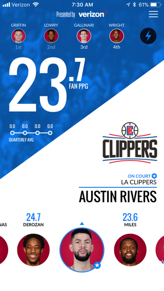
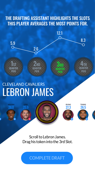
I inherited this screen from the shipped app. You scroll a carousel of round player portraits, called tokens, and drag one into a quarter slot. In v1 the slots were tiny circles at the top, about 26px wide, while a huge fan points number and the team logo took the middle of the screen. To fill a slot you dragged from the bottom up, so your hand covered the stats you needed to see while you were dragging. In v2 I proposed fixing the hierarchy. The proposal made the slots the largest targets on the screen and moved the tokens to just below them. That also left the top free for guiding copy or a sponsor. The team and player name got a less prominent spot. That was a compromise I accepted for a clearer signal of what to do.

v1 · shipped, inherited
v2 · my proposal, never shipped
  1. Slots get the most room. The v1 slots were about 26px, well under the common 44pt minimum touch size, so I made them about 58px and the largest targets on the screen.

  2. Slots that look like wells. I gave each slot subtle depth effects like drop shadow and labelled it "1st Quarter Pick" and so on, to imply that it takes a token and what it’ll be used for.

  3. The average labels its slot. The v1 quarterly average line sat apart from the slots, so I put each point directly above its slot and made the line a Drafting Assistant that highlights the best quarter, the 3rd at 12.1 for LeBron.

  4. Less to read. I removed the big FAN PPG number and the team logo, and as a compromise moved the team and player name to a less prominent spot.

  5. Hand off the content. Putting the tokens just below the slots was designed so the finger no longer covers the information you need to see while you drag.

  6. Instruction where you act. V1 had no guiding copy, so I proposed one line between the tokens and the button, so players can recognize the step instead of recalling a rules card from four screens earlier.

  7. One clear main action. The v1 lightning bolt was the same size as the slots and sat in their row, so I proposed a "Complete Draft" button at the familiar bottom-center spot.

v2 returning player. The same draft, with the free top of the screen used for a sponsorship placement.

BACK

  • CTA is clear
  • Navigation is consistent
  • UI behaves as expected
  • Anchoring
  • Content is relevant
  • Content is scannable
  • Drafting Asst eases Decision Fatigue
  • Optimized cognitive load

(The total cognitive load, or amount of mental processing power needed to use InPlay, affects how easily users find content and complete tasks.)

Two smaller decisions

Ask for permissions right before it's needed

InPlay synced to the TV broadcast through the phone's microphone. The shipped app asked for that permission one tap after Play, before a new player had any reason to trust it. I moved Live Sync to just before Live Play, so the request would come when the reason for it is on screen. The new-player tutorial runs on a scripted highlight clip, so a first-timer would learn Turbo, and draft for a real game, before ever seeing the mic request.

Mic permission

Users should have a clear idea of why a permission is being requested.

Permission requests should happen as close to the needed event as possible.

One announcements screen for two kinds of player

I added an announcements screen after the splash that changes with the player. New players get one instruction and a Choose Game button. Returning players get what's new since their last visit, like a $35,000 All-Star tourney closing that night and the hours left on their boost.

Announcements for new players
Welcome back

AUDIT CRITERIA

FINDABILITY
Users can easily find what they are looking for.
DISCOVERABILITY
New Content and/or Features is easily presented for Users to know about.

Adding an announcements screen is a versatile way of establishing various user behaviors based on their current level of experience with the product. The screen can gradually onboard new users with simple task completions to build user trust. For our experienced users we’ll use announcements to improve discoverability for new features and experiences. The screen is essentially a responsive graphic tailored to either new users or return players. CTA and copy is also responsive to whether the user needs clear instructions on what to do or if we’re just presenting fresh content.

If it had shipped

What I would have measured

If v2 had shipped, I would have tracked time to first draft, tutorial completion, the mic permission grant rate, and how many new players came back on day 1 and day 7.

InPlay was retired before this went into production.

Back to the portfolio